Approach
We found out that BusIt had an idea of their user groups, but not what each one would need, and want, to make their transit experience easy. We decided that the best way to engage with users was for me to get on the bus and talk to them. Through doing this we learnt about all the small things that different people experience when taking a bus. Such as visually impaired people having to use the sound of the bus to wave it down, and count the stops to know when to get off.
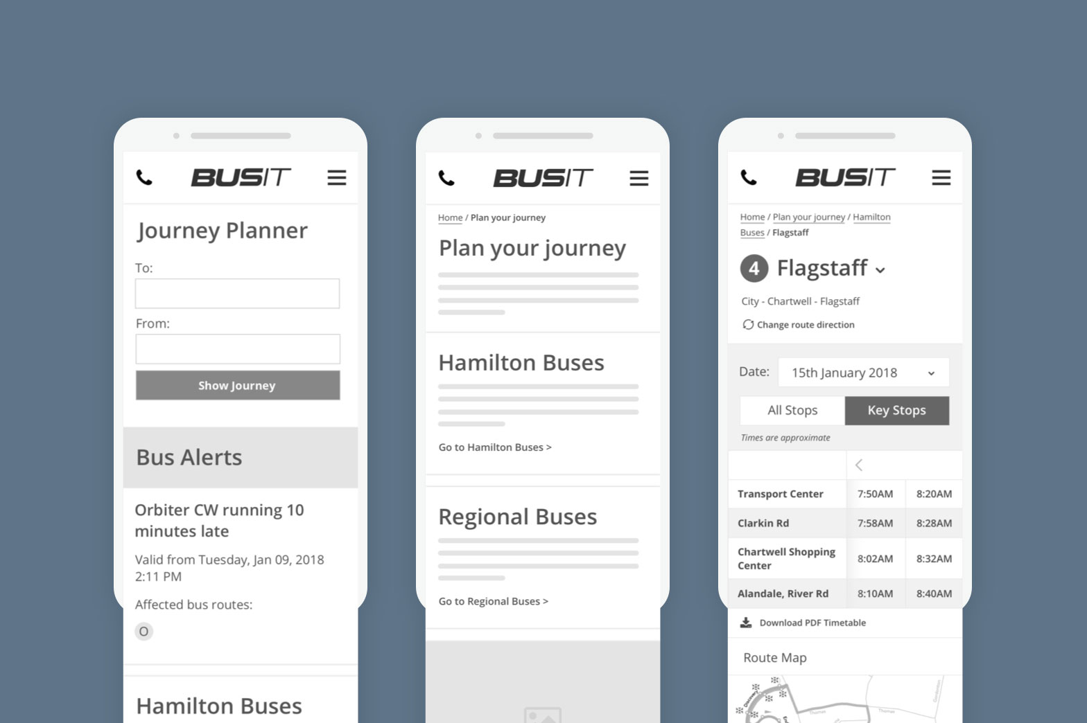
When I’d completed all the interviews, I took my learnings and created a wireframe prototype using Sketch and Invision. Then it was back on the bus to test the prototype with users. We were able to correct navigational errors, iterate and test with more users which gave us the room to create a well rounded experience.
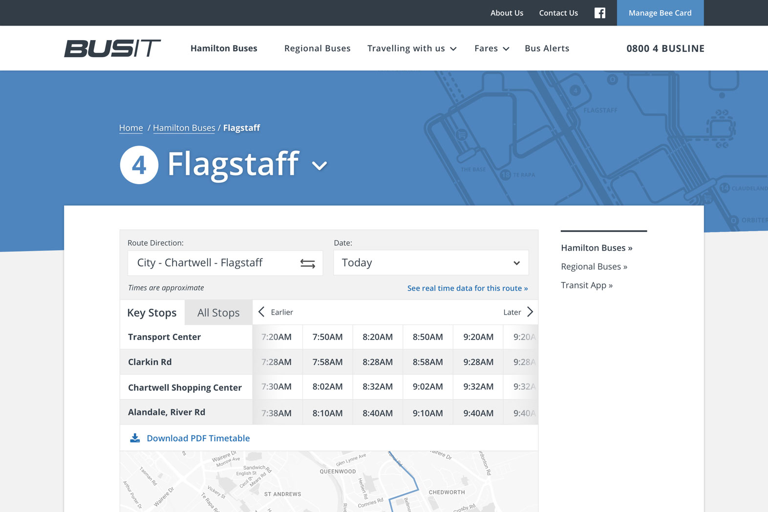
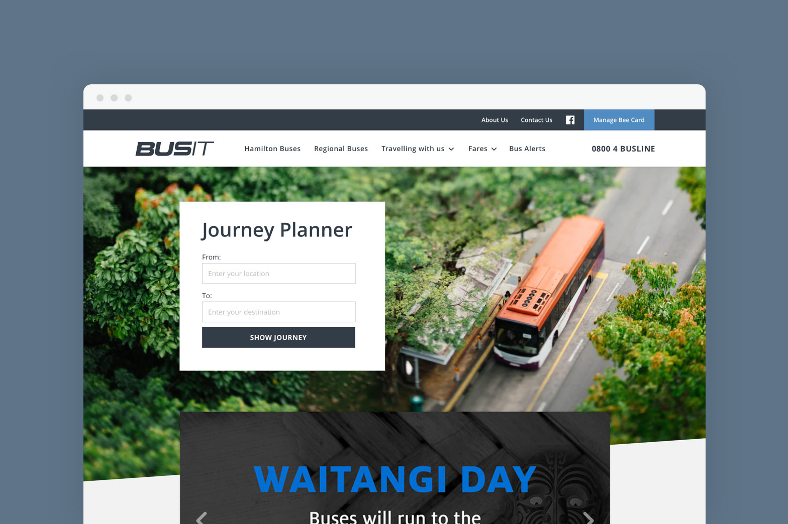
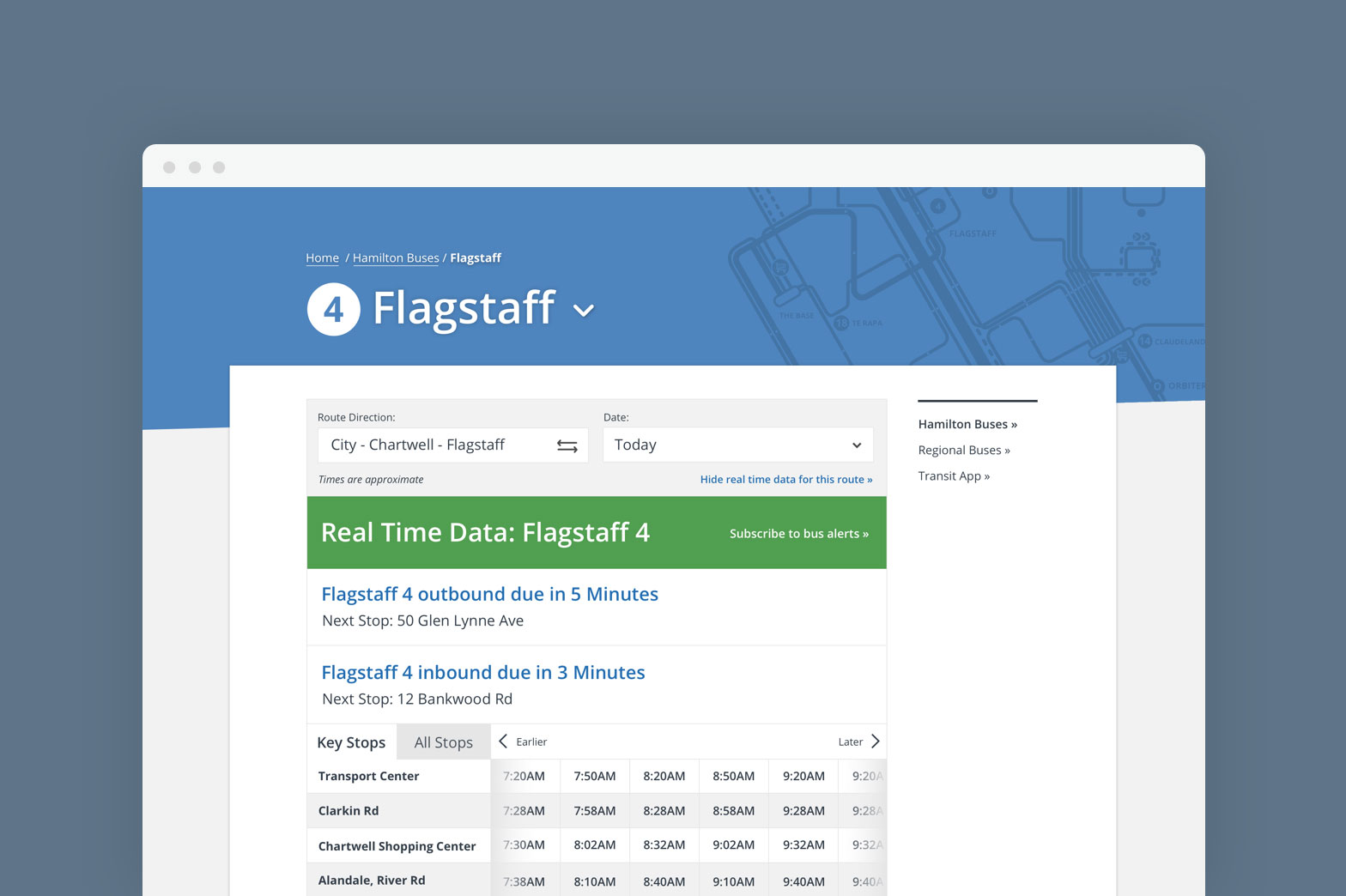
For the visual style we aimed to keep it clean and light as we wanted to focus on accessibility and ensuring users could find what they need easily. We added subtle details to the design, such as route map graphics and angled lines to fit the BusIt brand and make the website design unique to them.


