Approach
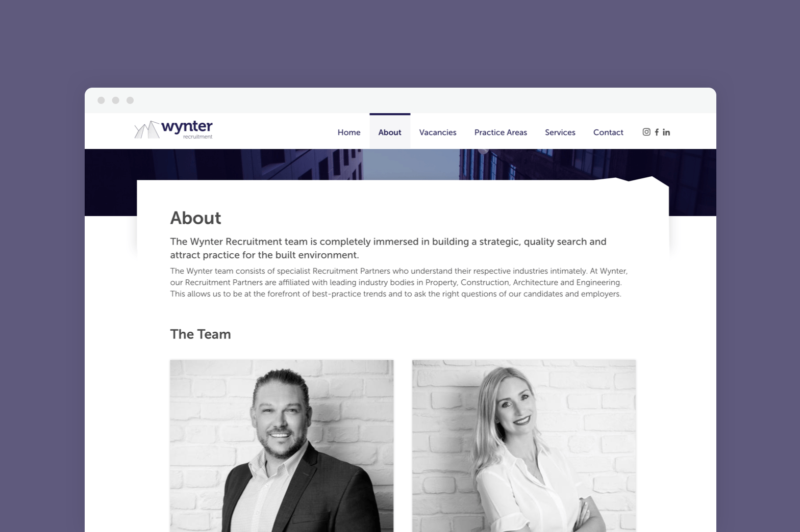
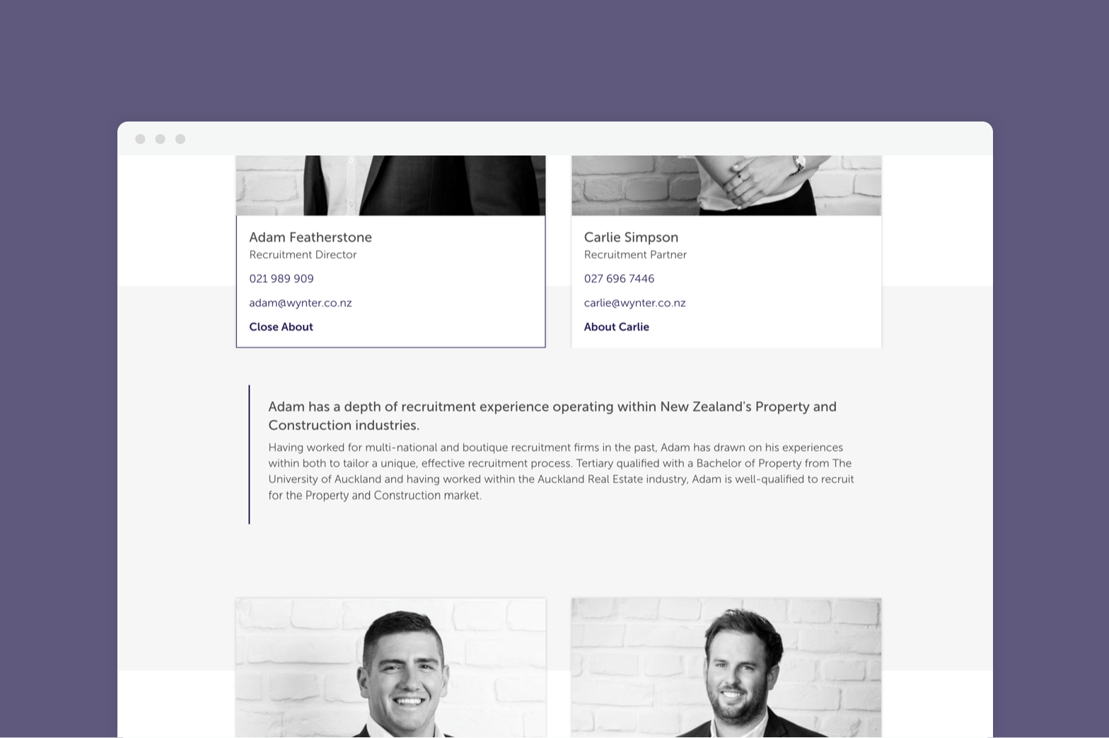
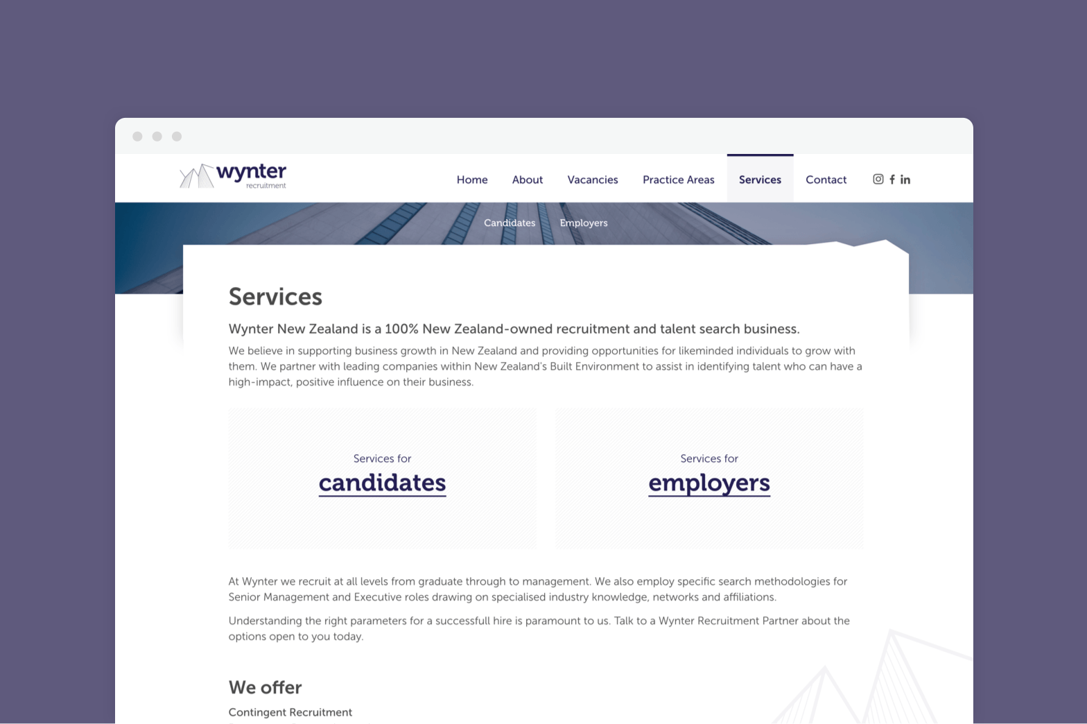
With this site I made sure to keep a clean and open design look, as this gives a professional, and trustworthy feel. To make sure that it didn’t lack character, the typography and elements from the brand were included throughout the design. These brand elements can be seen in the buttons, subtle background images, and the shape of content areas.
wynter.co.nz


